
Project Description:
Logo design:
Fast food/products: Sandwiches.
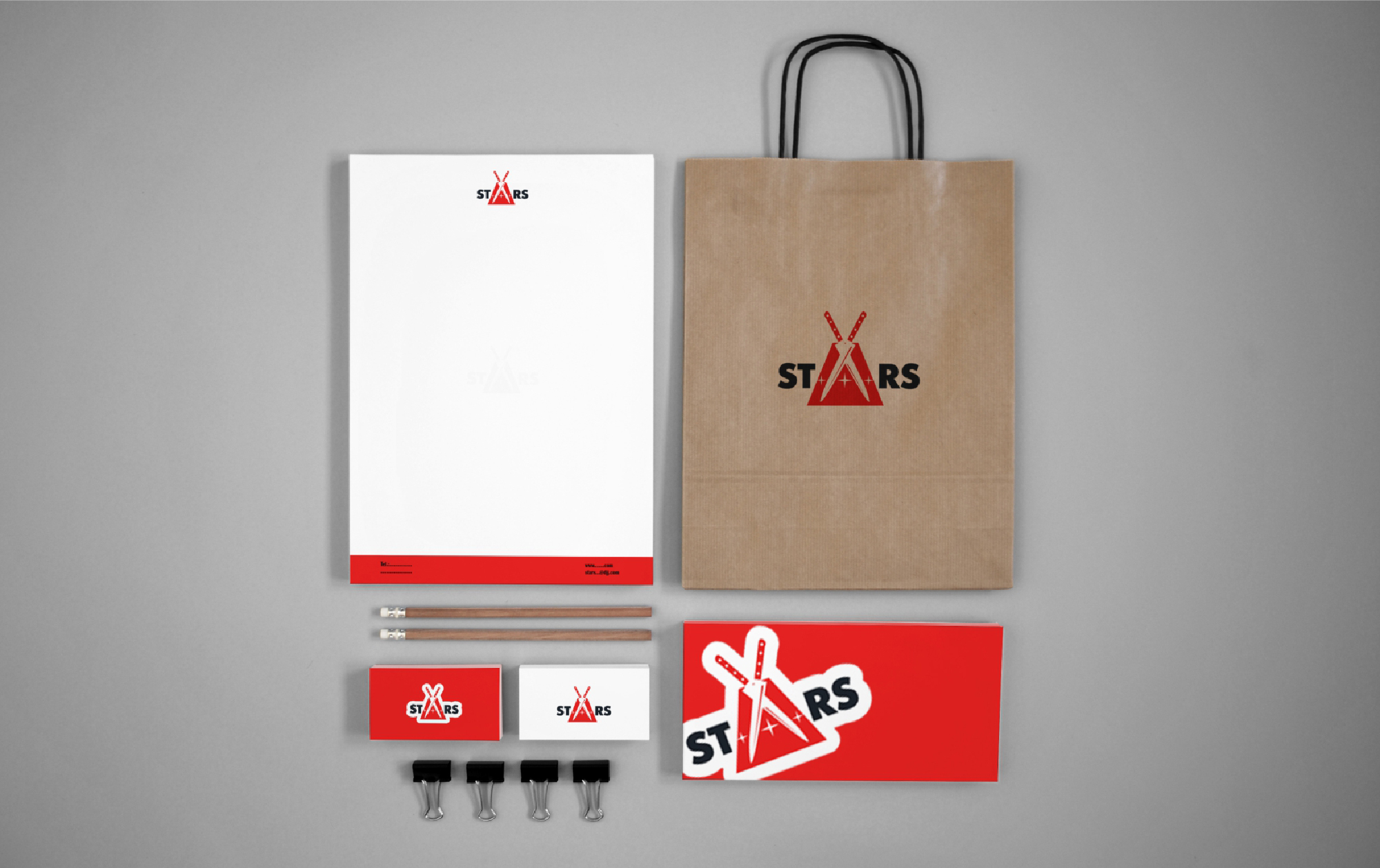
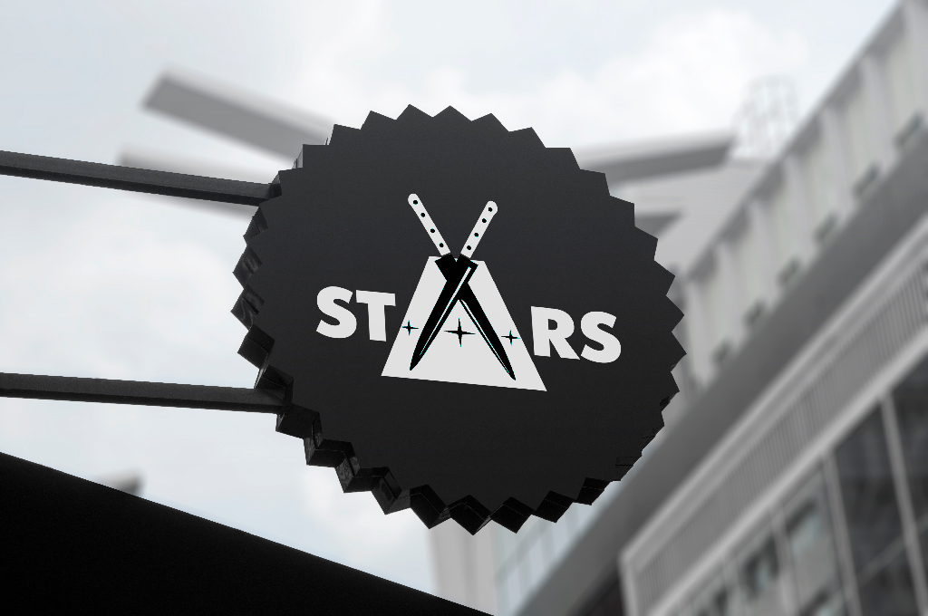
The logo will be applied as a separate label on the container and will also be placed on the label and sign.


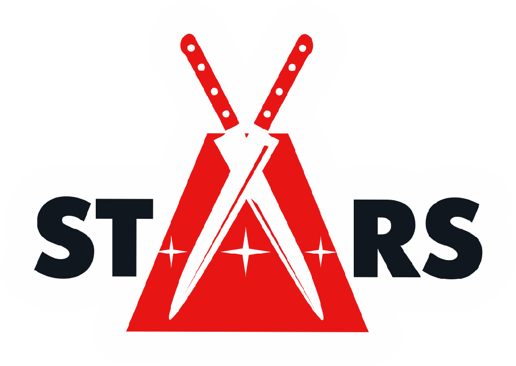
PANTONE485C, PANTONE Black6C, PANTONE White
Development
The logo should be easy to remember and easy to read, both near and far.
To implement this task we chose a typeface with a simple typeface (sans serifs) in bold mode.
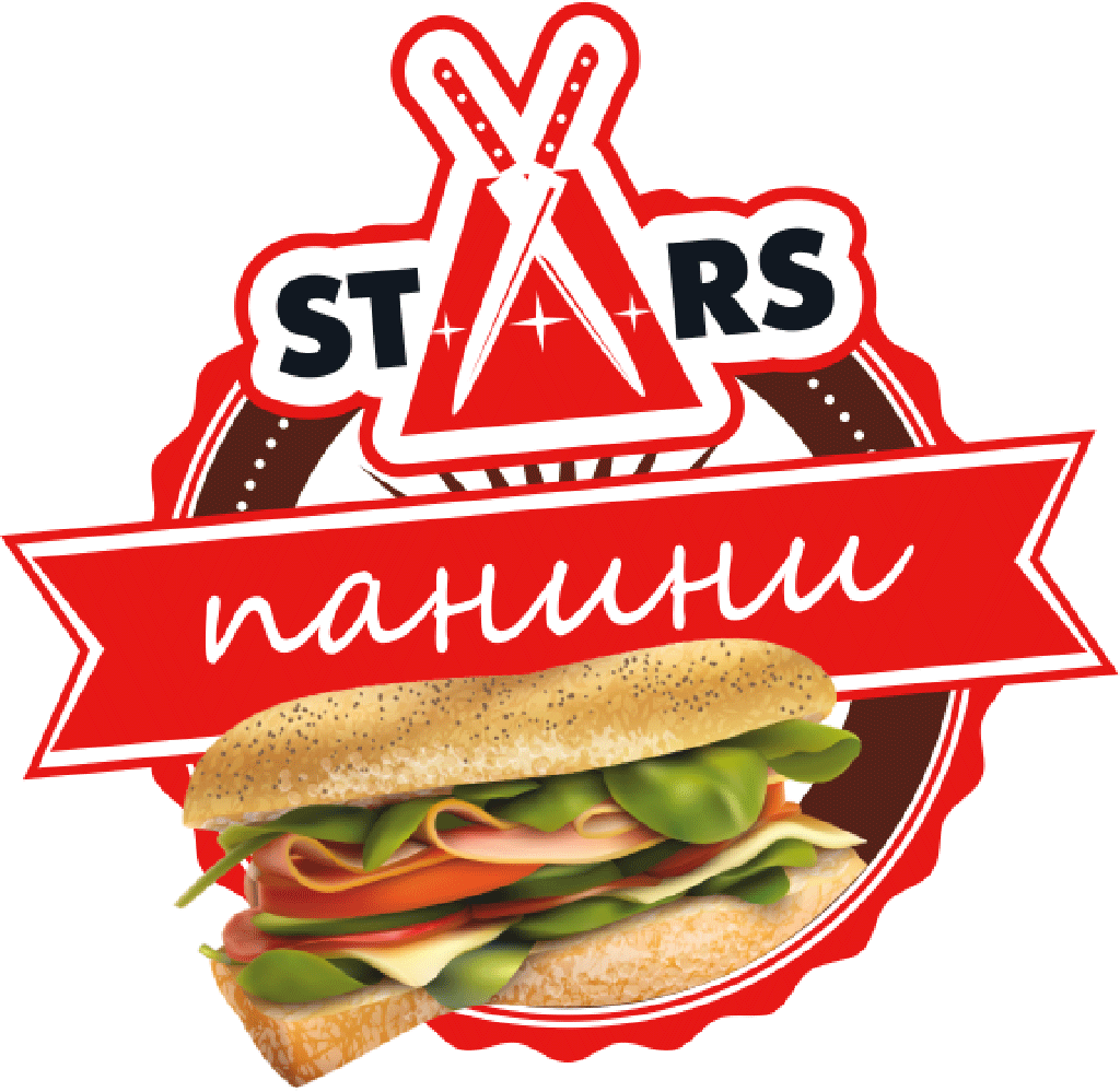
The letter “A”, in the center of the word, is represented as a graphic drawing, where it is manifested by a combination of two knives and a strip of stars.
In general, the drawing depicts culinary knives in sheaths, indicating the scope of catering, fast and fresh, literally “under the knife”.
As an additional symbol, the drawing resembles a mill, so it speaks of working not only with meat, but also with bakery products, which is part of the sandwich.
brand identity
